
ResourceSpace has changed the way the DEC uses content, making it much easier for us to quickly make assets available both internally and externally during our emergency appeals.
Blog
13th December 2021

When uploading an image to your website do you consider how that image will affect user experience? If the answer's no, then you're probably using unoptimised images.
But why does it matter?
In this blog post we're going to look at why you should be thinking about it, and explore how to optimise images for the web without losing quality.
Before we dive into how to optimise images for the web, let's look at why you should be using them in the first place.
Photos, charts and illustrations do more than just break up the text and make the content appear easier to read - they actually improve our comprehension of what we're reading. Our brains process images 60,000 times faster than text, which helps us to digest concepts more easily and retain information for longer. In fact, a visitor to your website is likely to remember just 10% of what they read three days later, but that jumps to 65% if the text was accompanied by a relevant image.
Including images in your content also helps with search engine optimisation (SEO). On average, an article with images receives 94% more page views than those without. What's more, visual content increases conversion rates by 7x, while articles with images every 75-100 words are shared twice as often on social media.
READ MORE: Find out about Digital Asset Management for SEO
The original version of an image, whether it's a photo, illustration, logo or icon, should be of high quality. A photo taken with a modern smartphone, for example, can be upwards of 20mb. By comparison, the featured image at the top of this article is just 29.6KB.
Image optimisation is the process of reducing an image to its lowest possible file size without impacting perceptible quality. It's also about making sure web images are the right format and dimensions for the specific use.
You need to make sure that every image you use looks right regardless of device or screen size, but the most important reason for optimising images for the web is to reduce page load speed.
When your browser opens a web page it has to load every single file uploaded to that page. The larger the file, the longer it takes.
The difference a single unoptimised image makes to website page load speed versus an optimised one probably isn't perceptible to the user - it's fractions of a second - but if there are multiple unoptimised images it can add up, and that's when it has an impact on user engagement.
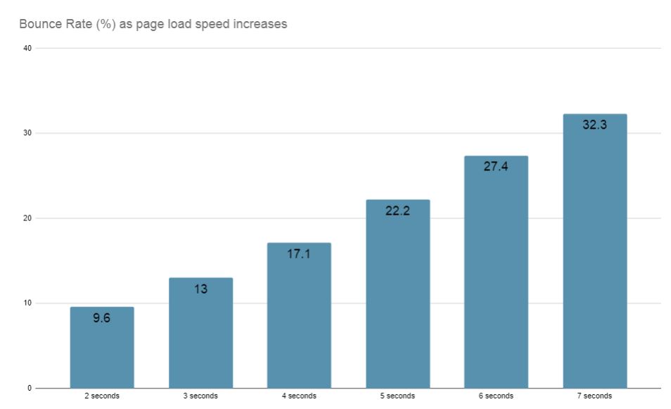
A page speed of just two seconds is enough for a bounce rate of 9.6%, while that increases significantly for every following second, hitting 32.3% for a 7-second load time.
Page speed is a recognised ranking factor, which basically means the faster your pages load, the better chance you have of ranking for the search terms that are important to you.
What's more, because slow loading websites also increase bounce rate and reduce 'dwell' time, Google recognises this as a poor user experience and is therefore less likely to rank that page in future.
The consequences of not properly optimising web images are significant, but fortunately it's not a complicated process.
Don't make the mistake of choosing visually low quality images for your website because you think it'll help page speed.
Photos that are pixelated or graphics that are hard to read won't help increase user engagement. It's much easier to reduce the file size and dimensions of high quality images than it is to blow up lower resolution ones, so start with the best you can find and go from there.
One of the easiest ways to reduce image file size is to compress the image. If you're using JPGs (more on file formats later) this can be done with software like Adobe Photoshop, or free image editing software such as Pixlr or GIMP.

Above you can see this in practice. The image on the left is a JPG saved at full quality and is 36KB. The image on the right was saved at 50% quality and is just 4.62KB.
Using images with dimensions that are too large for the web page will sometimes 'break' the page, expanding out beyond the limits of the section. This is easy to spot and resolve, but sometimes a content management system (CMS) will reduce the dimensions to make sure the image fits - but it doesn't reduce the file size.
Allowing the CMS to resize your images might save you time, but it's going to add valuable seconds to page load speed. Full size, unedited images will often have huge file sizes, but this can be resolved by saving them at the maximum required dimensions.
The maximum dimensions for each image location will depend on your site's web page design template, but some general guidelines are:
The ideal file format for your image will depend on how it's being used. Below are four of the most popular file formats for web images.
JPG/JPEG
JPGs, also known as JPEGs, are probably the image file type you're most familiar with. They support a wide range of colours, but they can also be easily compressed.
For the most part JPGs will be the most suitable file format for your image, but there are a couple of use cases where JPG won't be ideal, and both examples are the result of that compression.
If the image is undergoing multiple rounds of edits it will be compressed slightly more each time it's saved. That means the loss of quality may become noticeable if it's edited enough times.
Images that need to be sharp should also use a different format, as the compression can render lines, edges and icons as blurry, reducing the contrast with the background.
PNG
Like the JPG, PNGs support a wide range of colours, but importantly they can be edited multiple times without any loss of quality. However, the most popular use case for PNGs is when you require an image to be transparent. That is, when you need to remove the background.

The ResourceSpace logo above doesn't have a grey background - the background has been removed which means the colour of this blog article page is visible.
Note that PNGs can have very large file sizes, so they should only be used when you require transparency or you're worried about losing quality with a JPG.
GIF
GIFs are the only file format to support animation, but they can also be used for static images. The quality is lower, but so is the file size. This makes GIFs ideal for small icons or thumbnails that don't need to be high resolution.
SVG
Your website will be viewed on PCs, smartphones and tablets, and this means your images need to scale depending on the screen size. Vector images (SVGs) can be scaled up and down without losing any quality, which makes them ideal for web images, but the tradeoff is that the file sizes are larger. Because of this, use SVGs with caution, and always use a JPG where possible. Note that SVGs have smaller file sizes than PNGs.
A Digital Asset Management (DAM) system like ResourceSpace can help make image optimisation easier, and make sure your web team is only using images that are the right size.
Make basic edits to images on the fly, download different versions based on use case, and restrict access to only the correct image types. Ready to find out more about how ResourceSpace makes Digital Asset Management simple? Launch your free DAM instance within seconds.
#WebDesign
#UserExperience
#SEO
#VisualContent
#WebsitePerformance
#BestPractice
#ResourceSpaceTips
ResourceSpace has changed the way the DEC uses content, making it much easier for us to quickly make assets available both internally and externally during our emergency appeals.

The ResourceSpace team has been exceptionally good at support services. They make everything so convenient and efficient with the cutting edge technology. Kudos to the team.