
The team at ResourceSpace have been a joy to work with, helping us manage what could've been a really difficult transition every step of the way.
Blog
20th September 2018
![]() I'm Jon Hicks and I'm a graphic designer that goes by the name HICKS. While my experience is broad, I particularly enjoy identity work (Firefox, Shopify, Mailchimp), iconography (Spotify and Skype) and interface design (Opera Browser). In fact, I redesigned the ResourceSpace logo two years ago, and have been working with them on other design needs ever since.
I'm Jon Hicks and I'm a graphic designer that goes by the name HICKS. While my experience is broad, I particularly enjoy identity work (Firefox, Shopify, Mailchimp), iconography (Spotify and Skype) and interface design (Opera Browser). In fact, I redesigned the ResourceSpace logo two years ago, and have been working with them on other design needs ever since.
Not every user inferface (UI) needs to be completely redesigned from scratch. It's important that it's not change for the sake of change, and that the revisions have a clear purpose.
The ResourceSpace UI, like any web page, is constructed of three parts: HTML (which is the actual content itself), Javascript (which controls how it should behave) and CSS (stylesheets that controls how it should look). It's this last part that the ResourceSpace team hired me to update, with an open brief to change what I felt necessary. It's also useful to have an outsider come to the interface fresh - when you've worked so closely on something inhouse.
In this post I'll explain the changes that were made and why.
First, the 'how'. The tools I used for this task are widely and freely available as a feature of the Firefox Browser: Firefox Developer Tools. These allowed me to inspect, copy and override ResourceSpace's stylesheets with the 'Style Editor', creating my own version. Any changes I made to the stylesheets could be previewed instantly without the need to refresh every time or touching the real files on the server.
Using these tools, the first part of the process was to spend some time getting acquainted with how the UI is marked up in the HTML and styled in the relevant CSS. Changes to one part could affect an element elsewhere, but it is simple and risk free to experiment.
Whilst inspecting an element (a button, for example) I can look at the stylesheet rules affecting it, edit them if necessary, and then save it, all within the browser.
The key questions I asked when evaluating the interface were:
Let's have a look at what changed:
On screens with form fields, the white background colour from the tables was removed, putting the focus onto the form fields to be filled in:
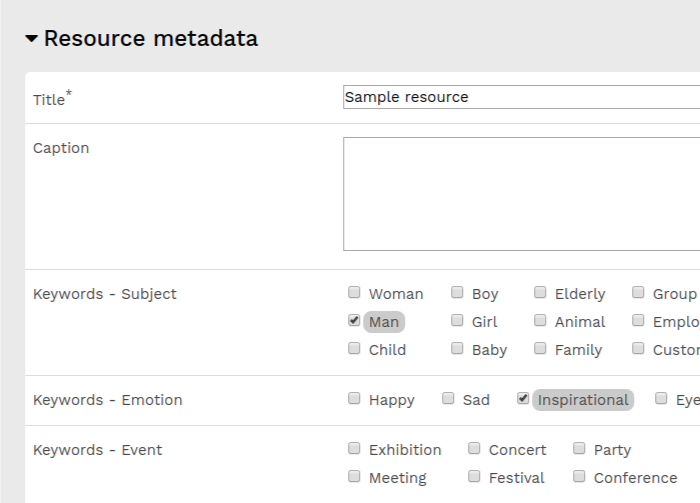
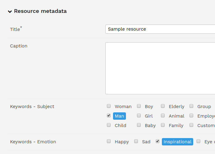
There is a danger that grey can be read as 'disabled', so the selected keyword colour was changed to blue to be a more positive selection and also increase contrast. More padding was added inside the text fields, making the text even clearer.
All of the text fields, dropdowns and buttons were updated for consistency. In particular, there were views where buttons looked more like table cells:
Now they appear as buttons, that look like every other button:
Dropdown arrows now use a chevron icon instead of a triangle, as this is used elsewhere in tree lists to show and hide content.
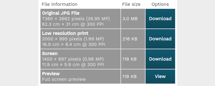
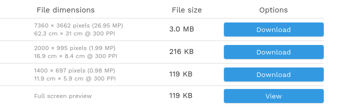
The heavy background colours on the header tools panel weren't necessary, so they were removed, leaving the download options focused. 'Resource Downloads' and 'Resource Details' are the same type of information view (tables) so they need to be treated in the same way.
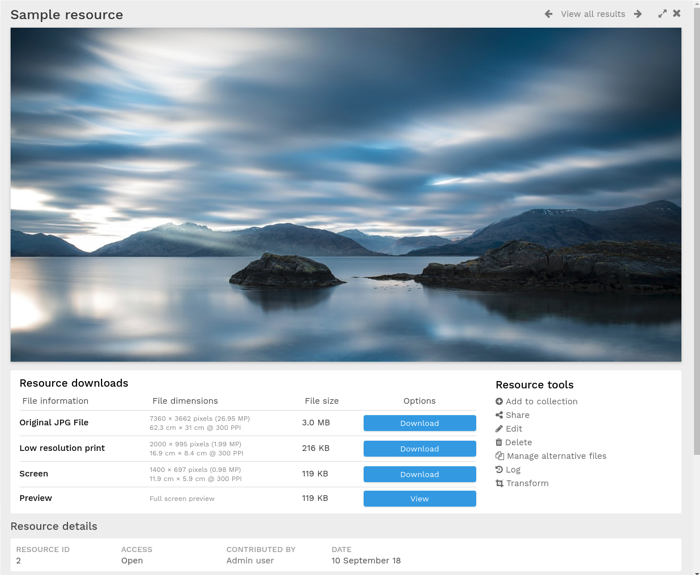
The strength of less important information, such as file dimensions, were reduced to make each row easier to scan read. Also, whitespace in between columns makes vertical dividers redundant, leaving just the dividers between rows. Doing this meant the border underneath 'Resource Details' was no longer necessary, so that could also be removed. In short: only using the visual elements that were necessary, and removing the rest.
Layout-wise, the image is now full width, with the download and tools options underneath. This was a particular change that the ResourceSpace team asked for, and I think it makes it cleaner and simpler.
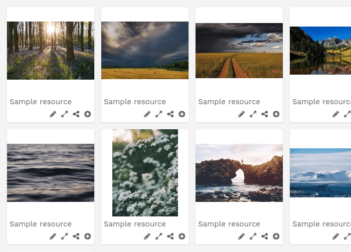
Finally some smaller changes were made to the grid view:
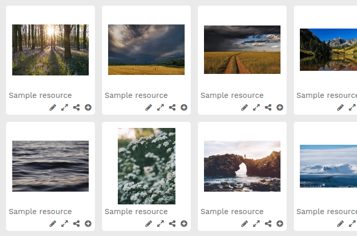
As well as making the image as large as possible with each 'card', images and thumbnails have subtle shadows. These help subtly push the actual content closer to the viewer, without distracting. It's all too easy to overdo shadows and make them visually heavy. The lighter page background can also be seen here, giving the page a brighter aesthetic:
There were many other subtle changes, all made to help readability and general appearance. More wide-ranging changes than this would require more time and edits in the HTML page as well, making it a much larger task. This shows what can be done with just updating stylesheets, and that simple changes can make a difference.![]()
#ResourceSpaceTips
#ProductUpdates
#WebDesign
#BestPractice
#InterfaceDesign
The team at ResourceSpace have been a joy to work with, helping us manage what could've been a really difficult transition every step of the way.

I've found it extremely easy, comfortable, simple and fast. We are extremely happy with the tool and their support.